Will the Future of Healthcare Shift Towards Value-based Care?

Social-Determinants

Is the future of healthcare shifting towards employing clinical analysis technology to administer value-based care? Analytic technology allows healthcare providers to understand their patient population better using social determinants of health. The analytic technology uses electronic health records to measure health trends amongst the targeted population.

Value-based care is collecting relevant data sources specific to socio-economic and social determinants of health unique to a specific population to plan appropriate interventions. These strategies have the potential to improve health outcomes specifically targeted areas at lower costs. Cost can be lower through a thorough analytical investigation of community needs trends and provider behaviors that increase cost. Carilion Clinic in Virginia is currently utilizing value-based care and analytical technology to serve its community better.

For more information check out this article:

https://www.healthcareitnews.com/news/analytics-social-determinants-drives-millions-value-based-savings-carilion

Image:

https://www.alliancebhc.org/general-news-announcements/alliance-grants-target-social-determinants-health/

Urbanization And Biodiversity

“It’s the end of the world where we thought nature was an infinite resource and we could exploit it without consequence.” – Richard Weller, a landscape architect at the University of Pennsylvania

See how maps are being used to show hot spots of biodiversity under threat. Such maps can be used to aid in good urbanization planning to decrease stress on vulnerable ecosystems. Check out the article here.

01-biodiversity-indonesia-burma.adapt.1190.1

The Availability of Food

These maps from 2010 show the availability of grocery store locations and also the percentage of people who had a car to get there. The topic of food availability is already an interesting conversation.. is there enough food? Is there enough food, but it just isn’t distributed evenly? Why is healthy food more expense then unhealthy? Why has food become more of a business then of a way to survive? Take a look at these maps, because they bring another problem into the mix! Transportation and accessibility.

The information for the maps was collected from the USDA Food Environment Atlas and the maps were created by Meharry Medical College.

Screen Shot 2016-08-04 at 4.01.55 PM.pngScreen Shot 2016-08-04 at 4.01.44 PM.png

Vacant Housing Units 2010- 2014

This map was put together by Meharry Medical College with data from 2010- 2014 from the  America Community Survey. The data represents the percentage empty housing units across the US with the lightest color representing 1-12.4% and the darkest red color showing 44.9-81.3%. View this map and other data maps on communitymappingforhealthequity.org

Vacant-Housing-Units_V2-2-1024x768.jpg

nj.mapplerx.com/map/urisahealth

Take a look at this interesting map we made on Mappler in collaboration with Planning Communities! The map is full of GIS layers that you can toggle to show various information such as crime, food, recreation, transit, and URISA health data in DC. The picture below shows URISA data marking sidewalks, intersections, homeless locations, and garbage. Visit the map to view all the data ! nj.mapplerx.com/map/urisahealth

Screen Shot 2016-06-08 at 11.31.16 AM.png

Climate Change- How Sea Level Rise Could Change Where & How We Live

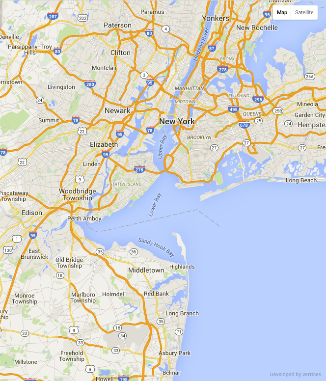
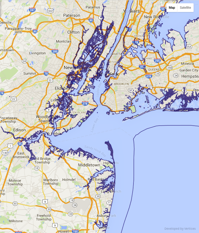
Climate change is always a hot topic, literally. With the melting of the ice caps, the unstable polar vortex which influences the jet stream, and with temperatures becoming more extreme, it is no mystery that sea level is continuing to rise. We wanted to visualize the threat of sea level rise by making a map that shows the potential projections of how our coasts in New Jersey and New York could eventual look.

nyc 1   nyc2   nyc3
We zoomed in to focus on New York City and the Northeastern part of the New Jersey coastline. We gathered the information for sea level rise from usgs.gov and then created the map using our Mappler technology. The first image is what the coast currently looks like, with the second and third images showing possible sea level rise projections. Image 2 shows sea level rise projections for 2100 if climate change continues without us taking action. This projection shows a 2m rise, with the dark blue border showing the potential new coastline. Image 3 is the worse case scenario for the year 2100, meaning that this is what scientists are projecting if again no action towards stopping or slowing climate change takes place and if the Greenland ice sheet melts. Image 3 shows a 7m sea level rise, and as you can see the land taken is massive. These maps show the scary reality that we could face if climate change is not taken seriously. You think that the population and its growth are bad now? How about when we then have to face displacement of part of the population because land where they use to live is covered in water? Take action, educate on climate change, and do your part!

To see the map and view more of the NJ and NY coast projections click here!

Happy Earth Day! NYC Tree Map

Trees help city areas with reducing pollution, they help to improve health, and overall bring a sense of calm to a place known for fast-pace living. Here is a map we created on Mappler using data from the TreesCount! 2015 by the NYC Department of Parks and Recreation. This map is color-coded based on condition of the trees. 

Screen Shot 2016-04-22 at 3.19.44 PM.png

Looking at the density screenshot, it is interesting to view where the best versus worst rated trees are located. The photo on the left shows where the worst rated trees are, and the right shows the trees rated as the best. Lets keep adding trees to our concrete jungle! Click here to see the site.

Good_Trees.PNG      Poor_Trees.PNG

NYT Income and Life Expectancy Map

It seems logical that the more money you have, the longer you would be expected to live. This would be because you can afford better healthcare, maintain a healthier lifestyle, have access to better nutrition, and probably have less stress when it comes to day-to-day life because you are financially stable. The New York Times recently released an article that affirmed this thought, but also gave an eye-opening spin on the life expectancy of the poor based on where they live, showing that cities like LA and New York the life expectancy of those under the poverty line is higher then other cities in the US.

Health plays a significant role in the life span of a human, which seems obvious but when you look at the numbers, it can be shocking. The Journal of the American Medical Association states that the richest men live 15 years longer then the poorest 1 percent. So why do the poor living in cities like Las Vegas, Indianapolis, Dayton, and Tulsa to name a few, have lower life expectancies? David M. Cutler who is a economist at Harvard explains that a lot of cities with the lowest life expectancy for the poor fall into the “drug overdose belt”. Other explanations are just the availability to clinics and health education. Increasing health resources would slowly help to increase life expectancy in cities with the lowest life spans.

Take a look at the map from the NYT and see where your area compares. Looking at where you live, do you think your area provides enough health resources for those who can’t afford it?

Screen Shot 2016-04-12 at 12.16.13 PM.png

All information for this post is from an article by The New York Times.


Poverty Map- US Census Bureau

Here is another interesting map that we created using Mappler which displays the percentage of the population in 2010 that was considered below the poverty line. This information was gather from the U.S. Census Bureau. Red indicates areas where 30 to about 50 percent are considered living in poverty and blue shows areas where 0 to 10 percent are considered below the poverty line.

unnamed-1.png

Adult Obesity Map

This is a map that we created based off of data from the Center for Disease Control. This information shows the percentage of adults that were classified as obese in the year 2010. Blue indicates areas with the lowest percentages, while red shows areas where obesity in adults is more prevalent. It is interesting to think about the fact that we have so much food here in the US, yet getting a hold of healthy options is more difficult then it should be. #foodforthought

Screen Shot 2016-04-07 at 4.41.32 PM.png