Map of Evacuation Routes in Houston, TX

Please check out this map I created using ArcGIS. It details areas in Houston, Texas that are at-risk during an evacuation.

at-risk-population-in-houston.png

Click on the following link for more information about the map! https://noorg.maps.arcgis.com/apps/View/index.html?appid=8747f88810524c40bf7122fbbd759a42

Radon Levels in the USA

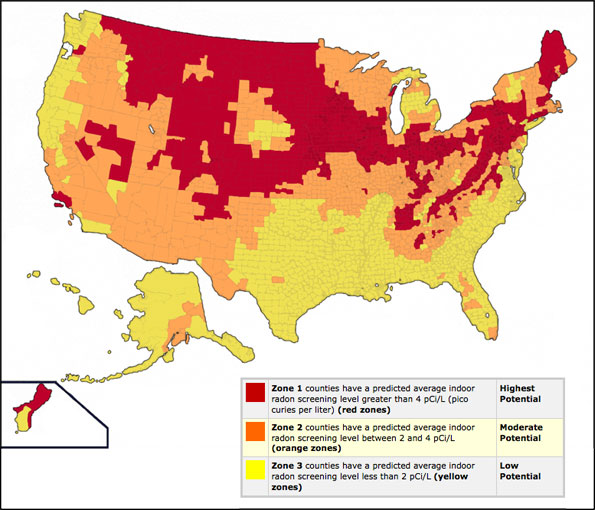
This is a follow up post about the radon levels in the United States of America. As mentioned in an earlier post, radon is formed when uranium breaks down into radium, which breaks down into radon. Radon is absorbed by the soil and ends up in water wells and home foundations. According to the Environmental Protection Agency (EPA), radon levels shouldn’t exceed 4.0 pCi/L (pico curies per liter). The map below shows the radon levels by color – yellow representing Zone 1; counties where average indoor radon screening levels are less than 2pCi/L, orange representing Zone 2, counties where average indoor radon screening levels are between 2 and 4 pCi/L, and red representing Zone 3, counties where average indoor radon screening levels exceed 4pCi/L.  According to the National Radon Defense, the best way to know the radon level in your home is to test for it.

Click here to visit the National Radon Defense website to learn more about radon, radon levels in the U.S. and radon testing.

radon usa

Source: https://www.nationalradondefense.com/radon-information/radon-map.html

HIV Prevalence Rates in GA in 2015

AIDSVu.org has information on HIV prevalence and incidence rates and cases from all counties and states in the U.S. The information is also broken down by demographic and mode of transmission. On the national map, it appears that the southeastern and eastern regions of the U.S. made up a significant portion of the persons living with HIV in the U.S. in 2015. Some of these states included Louisiana, Georgia, Florida, South Carolina, Delaware, New Jersey and New York. The site also provides information on services individuals can utilize for testing and treatment purposes.  The map below shows the rates of HIV prevalence in Georgia in 2015. According to the local data provided by the site, there were approximately 49,463 people in Georgia living with HIV at the time of data collection. To view more HIV data on specific counties in GA or from other counties and states in the U.S., click on the website, here.

Georgia-Map_cropped

Source: https://aidsvu.org/state/georgia/

Breast Cancer Incidence Rates in GA

The National Cancer Institute and the CDC developed a database with information on various types of cancer, areas in the country, demographics and statistic measurements. The map below shows age-adjusted incidence rates of breast cancer in Georgia from years 2011 to 2015, per 100,000 population.  The demographic of focus is females, 50 years of age and less, of all races.

Create your own map on the website, here.

incidence rates breast cancer

Source: https://statecancerprofiles.cancer.gov/map/map.noimage.php

Unemployment Rates in the U.S.

The Huffington Post published an article last year that included a map of the unemployment rates in the U.S. from 1990 to 2013. The legend on the map lists rates of unemployment, with green meaning an unemployment rate of 5% or less and red meaning an unemployment rate of 8% or greater. To get a better understanding of the changes in unemployment rates between 1990 and 2013, please visit the Huffington Post’s article, here. The map on the website is in motion, visually representing drastic changes in rates of unemployment by year.

When looking at the map in motion, I encourage you to think about everything that was going on in the U.S. and the world at the time. How might those events have affected the change in unemployment rates?

unemployment map


Source: https://www.huffingtonpost.com/2014/08/31/america-unemployment-map_n_5744656.html

Mapping School Suspensions in the U.S.

Suspensions and expulsions significantly impact students’ progress in school; they prevent students from receiving an education because they keep students out of the classroom. In 2015, the U.S. Department of Education held a conference for educators across the country to rethink methods of discipline that don’t involve suspension or expulsion. At this conference, alternative methods for disciplining students were introduced, including a School Climate and Discipline Guide Package that focused on protecting the civil rights of students and using non-exclusionary forms of discipline.

Below are two maps provided by the U.S. Department of Education. The first map illustrates the percentage of students with disabilities who received out of school suspensions (OSS) and the second map illustrates the percentage of all students who received OSS across the country.

Please visit the U.S. Department of Education’s web page here to learn more about this initiative.

IDEA Suspensions

Source: https://www.ed.gov/news/press-releases/educators-gather-white-house-rethink-school-discipline

Total SuspensionsSource: https://www.ed.gov/news/press-releases/educators-gather-white-house-rethink-school-discipline

World Map on Average Consumption of Sugars and Sweeteners

The Word Dental Federation created a map on the average consumption of sugars and sweeteners, measured by grams per person per day. This map is one of many maps created by the World Dental Federation about the indicators and factors of oral health and oral health related issues. Based on the map below, in most countries in the world, including the U.S., individuals are consuming more than 100 grams of sugar per person per day. This information is significant for developing policies and issues regarding oral health issues and chronic illnesses.

Visit the World Dental Federation’s website here to learn more about their work and maps related to oral health.

2018-06-13 (3)

Source: https://www.fdiworlddental.org/sites/default/files/media/43_map_oral_health_2.pdf


Heat Mapping in GA using GIS

The CDC conducted an interesting case study in which they mapped areas in Georgia that were most at risk to hazardous exposure from climate change. This map includes indicators such as percent of population below poverty level, percent 65 or older living alone, heat event exposure, percent of dialysis patients covered by Medicare, hospital insufficiency and percent impervious surface. To learn more information about how this study was conducted, check out the website here.

f5-cropped_12

Source: https://health2016.globalchange.gov/populations-concern

GA County Health Rankings

The Georgia Department of Public Health (GADPH) created maps of the health factors and outcomes in all of the counties in Georgia. The list of health factors include health behaviors, clinical care, social and economic factors and the physical environment. However, there is no mention of any oral health indicators. Health outcomes are defined as length and quality of life. Maps of these indicators and outcomes are helpful to better understand the impact of health issues in various populations. In the map below, the green counties represent health outcomes and the blue counties represent health factors.

Click on the source link below to access more information about GADPH’s state-wide data mapping efforts.

2018-06-08 (2)

Source: http://www.countyhealthrankings.org/app/georgia/2018/overview#!%2Fgeorgia%2F2018%2Foverview