You Can Now Fly with Marijuana!!!

flyingwithmmj

Travelers are now allowed to fly with marijuana when flying out of Los Angeles International Airport. Yes, that right! Los Angeles International Airport are now allowing their passengers to fly with up to 28.5 grams of marijuana and 8 grams of concentrated marijuana with no risk of arrest or confiscation unless that amount is exceeded.

Airport police would not confiscate it unless it exceeds California’s legal amount and will not stop or arrest you if they find marijuana in your carry-on bags.

The new marijuana policy reads

” While federal law prohibits the possession of marijuana (inclusive of federal airspace,) California’s passage of proposition 64, effective January 1, 2018, allows for individuals 21 years of age or older to….”

https://www.medicaljane.com/2013/10/07/tsa-policy-flying-with-medicinal-marijuana/


A Little Green Does the Body Good

We think that health maps do not only consist of physical health, but also mental! If you are living in the concrete jungle, and although it is beautiful in it’s own unique way, maybe you want to be surrounded by more nature.

I found this cool and informational map by Hana Alberts on ny.curbed.com that shows 40 gardens, parks, and green spaces in NYC that you might not know about! Instead of making the trip to Central Park, check out one of these cool spaces. Go to ny.curbed.com or click here to view the map and website! Thanks Curbed!

Screen Shot 2016-06-07 at 12.37.17 PM.png

2016 GIS and Health Symposium

Join us in Washington DC for the 2016 GIS and Health Symposium! This year’s theme is “Mapping the Way to Healthy Communities” and our very own Dr. Wansoo Im will be speaking along with Alyssa Randall from Planning Communities, on June 1st from 8:30am  to 12:00pm. Wansoo Im is an Associate Professor at Meharry Medical College and CEO and founder of Vertices LLC.

Learning Objectives: Provide participants with an understanding of how to actively conduct health resource, barriers and opportunities mapping inventories in the field to support local planning and project initiatives, by working with a local data from the Washington DC region. Through this workshop participants will learn about the types of health data sources and how to utilize available data, prepare for a field inventory, and collect field data including those resources not traditionally or typically mapped.

Workshop Overview: Local planning agencies, health departments, community organizations and other entities are increasingly addressing health considerations in planning and development initiatives. With significant variation in the level and quality of health-related GIS data available, as well as the need to encompass a broad range of resources that contribute to health outcomes, field data collection plays a critical role in ensuring that a comprehensive inventory of health resources, environmental barriers and opportunities is prepared to support policy, plan and project development. This workshop will review a broad range of data sets and mapping available and tips for compiling available geospatial information in preparation for fieldwork. Participants will discuss gaps in available data, as well as features and attributes to be collected or verified in the field considering a full range of resources that contribute to individual and community health and well-being. A local field review will be conducted and participants will have the opportunity to collect health related data just outside the doors of the GIS & Health Symposium. Come join us for this hands-on experience!

Additional registration fee for preconference workshops: $95 for URISA or APHA members/$125 for nonmembers


Click here for more information. All information is from gishealth2016.sched.org. The event is held by The Urban and Regional Information Systems Association in partnership with the American Public Health Association

Climate Change- How Sea Level Rise Could Change Where & How We Live

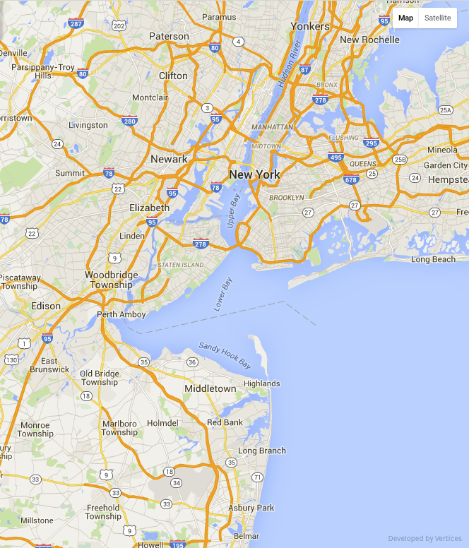
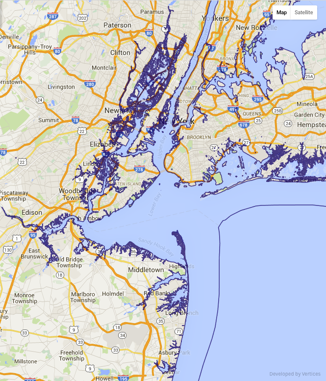
Climate change is always a hot topic, literally. With the melting of the ice caps, the unstable polar vortex which influences the jet stream, and with temperatures becoming more extreme, it is no mystery that sea level is continuing to rise. We wanted to visualize the threat of sea level rise by making a map that shows the potential projections of how our coasts in New Jersey and New York could eventual look.

nyc 1   nyc2   nyc3
We zoomed in to focus on New York City and the Northeastern part of the New Jersey coastline. We gathered the information for sea level rise from usgs.gov and then created the map using our Mappler technology. The first image is what the coast currently looks like, with the second and third images showing possible sea level rise projections. Image 2 shows sea level rise projections for 2100 if climate change continues without us taking action. This projection shows a 2m rise, with the dark blue border showing the potential new coastline. Image 3 is the worse case scenario for the year 2100, meaning that this is what scientists are projecting if again no action towards stopping or slowing climate change takes place and if the Greenland ice sheet melts. Image 3 shows a 7m sea level rise, and as you can see the land taken is massive. These maps show the scary reality that we could face if climate change is not taken seriously. You think that the population and its growth are bad now? How about when we then have to face displacement of part of the population because land where they use to live is covered in water? Take action, educate on climate change, and do your part!

To see the map and view more of the NJ and NY coast projections click here!

EIA- U.S. Energy Mapping System

Energy maps are one of my favorite maps to look at, mainly because I think it is great seeing how the US is making steps towards clean, renewable energy. Here is a map that I found on eia.gov that shows all of the energy mapping systems in the US, from clean green energy to fossil fuels. I decided to show only the renewable energy sources on this post, consisting of biomass power plants, geothermal power plants, hydroelectric power plants, pumped storage plants, solar power plants, wind power plants, and wood power plants. On the site you can also look at the fossil fuel sites, transport and storage sites, market hubs, and administrative boundaries. Check out the map and see what is in your area! Is your area a place of more renewable clean sources, or a place that still needs to make the change? Thanks EIA for this great map!

Screen Shot 2015-10-05 at 9.47.59 PM

All information and photo from eia.gov

Click here to see the site. Contact gis@vertices.com

NRDC- Renewable Energy for America

I found this really interesting map on Natural Resources Defense Council’s website that shows existing and planned renewable energy sources across the United States. I think it is super important to look into and input renewable energy sources, and that the US should continue to be open in incorporating lasting energy efficient sources of power. I feel like many other nations are ahead of us in making the switch from non-renewable to renewable sources, so lets continue to step up! Take a look at the map and see what green energy sources are in your state or soon will be. The map shows wind, solar, advanced biofuel, biodigesters, geothermal, and low-impact hydroelectric facilitates that are currently in the US and planned to be built or operated soon. Check out the site to see the energy map for the US or take a closer look at each state on www.nrdc.org/energy/renewables/energymap.asp.

This map shows all the existing renewable sources in the US.

Posted by Intern Eva Gerrits. Click here to see the site. Contact gis@vertices.com

CoolClimate Carbon Footprint Calculator

I think that it is incredibly important to be aware of your carbon footprint and have an idea of how much energy and resources you are using. I am a student at Rutgers and in my Energy and Society class one of our assignments was to calculate our household carbon footprint and see what we can change to lower our carbon count. One of the sites that I used was put together by The University of California at Berkeley, and can be found on coolclimate.berkeley.edu/carboncalculator. All you have to do is fill in some information in the five categories- Intro, Travel, Housing, Food and Shopping. Once all the sections have been filled out based on your personal energy usage and everyday choices, you’ll see what your total footprint is which is calculated on how much tons of carbon you use per year.

Screen shot 2014-12-15 at 1.12.05 AM


What I liked most about this site is at the end, it gives you options as to what you can do to lower your footprint. The site gives you things you can do at no cost and options for donations to offset your emissions. Check out the site and see what you can do to have a smaller carbon footprint .


Posted by Eva Gerrits, Intern. Click here to see the site. contact at gis@vertices.com

Reducing CO2 Emissions in NYC Buildings

Lab Mapper Screen Shot

Did you know that the majority of New York City’s CO2 emissions comes from buildings? Not exactly what you expected from an auto-dependent city? Heating, cooling, lighting, and general operations can use a vast amount of energy. To meet the goal of reducing carbon emissions by 30% before 2030, New York City is targeting energy reduction in the city’s largest buildings. Since 2010, buildings 50,000 sq. ft. and over have been required to benchmark their energy and water use as part of Local Law 84.

The Energy Locus map was created in collaboration with Mappler and the Community Mapping Initiative, a student interest group at the Edward J. Bloustein School of Planning and Public Policy, Rutgers. The map includes the 2011 EPA Energy Star score for hundreds of commercials buildings in New York City that were required to comply with Local Law 84.

This map allows users to search for addresses and determine a listing’s Energy Star Score. Buildings with a score of 75 and higher indicate the facility performs better than at least 75% of similar buildings nationwide when accounting for weather and operating conditions.

Source: http://lab.mappler.net/

Juhi Mawla, Intern, gis@vertices.com