Will the Future of Healthcare Shift Towards Value-based Care?

Social-Determinants

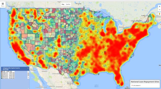
Is the future of healthcare shifting towards employing clinical analysis technology to administer value-based care? Analytic technology allows healthcare providers to understand their patient population better using social determinants of health. The analytic technology uses electronic health records to measure health trends amongst the targeted population.

Value-based care is collecting relevant data sources specific to socio-economic and social determinants of health unique to a specific population to plan appropriate interventions. These strategies have the potential to improve health outcomes specifically targeted areas at lower costs. Cost can be lower through a thorough analytical investigation of community needs trends and provider behaviors that increase cost. Carilion Clinic in Virginia is currently utilizing value-based care and analytical technology to serve its community better.

For more information check out this article:
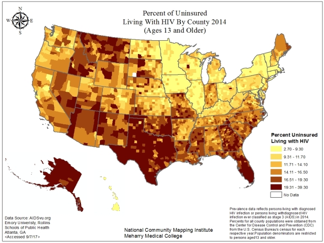
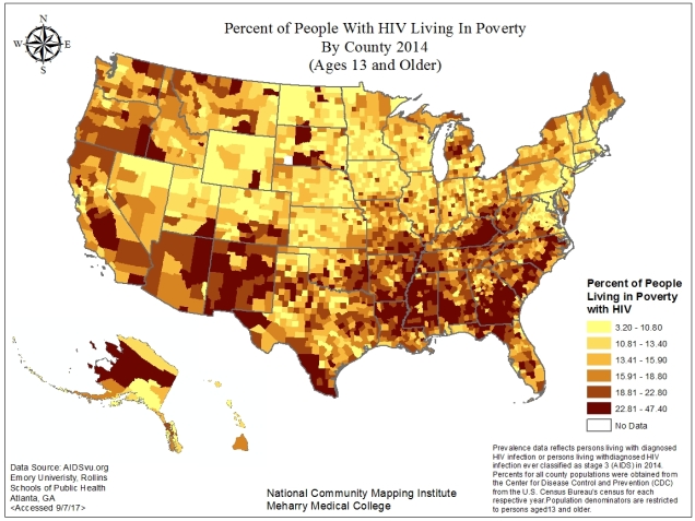
https://www.healthcareitnews.com/news/analytics-social-determinants-drives-millions-value-based-savings-carilion

Image:

https://www.alliancebhc.org/general-news-announcements/alliance-grants-target-social-determinants-health/

You Can Now Fly with Marijuana!!!

flyingwithmmj

Travelers are now allowed to fly with marijuana when flying out of Los Angeles International Airport. Yes, that right! Los Angeles International Airport are now allowing their passengers to fly with up to 28.5 grams of marijuana and 8 grams of concentrated marijuana with no risk of arrest or confiscation unless that amount is exceeded.

Airport police would not confiscate it unless it exceeds California’s legal amount and will not stop or arrest you if they find marijuana in your carry-on bags.

The new marijuana policy reads

” While federal law prohibits the possession of marijuana (inclusive of federal airspace,) California’s passage of proposition 64, effective January 1, 2018, allows for individuals 21 years of age or older to….”

https://www.medicaljane.com/2013/10/07/tsa-policy-flying-with-medicinal-marijuana/


Total Number of National Loan Repayment Sites 2017

Loadrepaymentinteractivemap

Check out this interactive map which shows the total number of loan repayment sites. The top layer is a heat density map showing the loan repayment site concentration. The red areas represent the more concentrated areas of the facility sites. We can see that the more concentrated areas are in the more populated areas and also along the Mississippi and Appalachian areas which are known as being undeserved areas. The bottom layer represents per capita income by county.

By Julia Watson

Rate of Self Reported Pesticide Related Illness By State 2014


MOTD10_2_17_Rateofselftreprotedpesticideillness

Today’s map shows the rate of self reported pesticide related illness by state for the year of 2014 per 100,000 person. From the map we can see some states had rates ranging as low as 0.00 to 0.27 indicated by the yellow shading. In contrast some states, such as Alaska, Florida, Alabama, Mississippi, Arkansas, New York, Kansas and Virginia had rates as high as 0.87 to 2.56 indicated by the dark blue shading. However, its important to note that because these are self-reported rates the date is subjected to under-reporting. In addition, because these exposures are self-reported both the type of pesticide and the degree of illness associated with the exposure may be mis-classified since the designation by the poison control center for both is based on the description provided by the caller.

According to the CDC farmworkers are among those when are subjected to pesticide exposure. For more information on migrant workers click here.

By Julia Watson

Opioid Epidemic Pushes Florida Medical Schools To Change Curriculum

The opioid epidemic is not secret and has been the talk of public health and any health advocates have been trying to find ways to combat the epidemic. A group of nine Florida medical schools in particular are coming together to develop a common curriculum focused on pain and opioid prescriptions for medical students. For more information click here.

http://www.orlandosentinel.com/health/94422092-132.html

By Julia Watson 

Percent of Uninsured Living with HIV By County 2014 (Ages 13 and Older)

AIDVU_%Uninsured

Check out this map which shows the percent of people living with HIV who were uninsured by county for the year of 2014 ages 13 and older. From the map we can see that a large portion of counties within Hawaii, the north east, and some midwest states had some of the lowest percentages of people with HIV who where uninsured indicated by the yellow shading. In contrast states in the south and west had some of the highest percentages of people living with HIV who were uninsured.  We can see Alaska and Texas were predominantly shaded dark, indicating percentages ranging as high as 19 to 39.

By Julia Watson

Percent of People With HIV Living In Poverty By County 2014 ( Ages 13 and Older)

AIDVU_%PovertyCheck out this map that shows the percent of people living with HIV who are living in poverty by county for the year of 2014. From the map we can see that a large portion of counties in the southern and western states have a higher percentage of people with HIV living in poverty, indicated by the dark shading. We can also see that Alaska has counties shaded dark, such as Yukon-Koyukuk Census area, indicating the percentage of those living in poverty range from 22.61 to 47.40.

By Julia Watson


President Declares The Opioid Crisis A National Emergency

It is well known that the US currently faces an opioid epidemic and according to the Department of Health and Human Services (HHS) since 1999 the rate of overdose death related to opioid, including both heroin and prescription drugs, has quadrupled. In addition to the negative health effects the epidemic has also had economic impacts on the health care system with nearly 55 billion dollars being spent a year on health and social cost related to prescription opioid abuse [1].

Health care providers have been working together to address the epidemic and recently President Donald Trump declared the the opioid crisis a national emergency. Check out the clip below and to read more click here.

By Julia Watson

Preventable Hospital Stay Rate By County 2013

Ambulatory-care sensitive conditions (ACSCs) are conditions where effective community care and management can help prevent the need for hospital admission. The map below shows the rate of hospital stays for ACSCs per 1,000 Medicare enrollees. From the map we can see a large portion of counties within western states had a lower ACSCs rate indicated by the yellow/light orange shading compared to counties within various southern states who had higher rates, indicated by the darker shaded counties. Map like this allow health providers to then look deeper into why these rates vary. For instance, since ACSC’s are medical problems that are potentially preventable, such as hypertension, health care providers might hypothesize counties with higher rates are lacking health care providers.

MOTD7_21_17_PreventableHospitalStay

By Julia Watson


Average Daily PM 2.5 By County in 2011

MOTD7_19_17_AvgPM252011
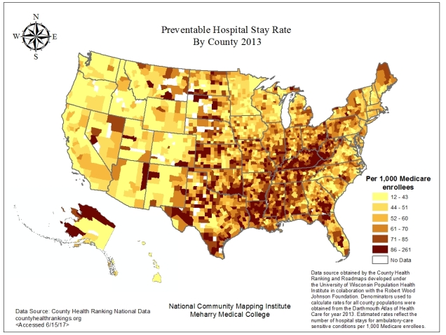
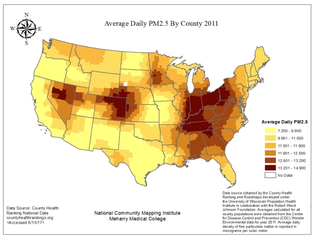
Particulate Matter (PM) are small particles that contain microscopic solids and liquid droplets that are suspended in the air which can be inhaled and cause health effects. PM range in size, but particles less than 10 mm present the greatest threat. Some particles are emitted directly from a source such as, smokestacks, fires, construction sites, etc. and others are a result of complex atmospheric reactions [1].

Check out this map that shows the average daily PM 2.5 by county in 2011. From the graph we see a three distinct darkly shaded clusters indicating a high amount of daily exposure. The first cluster includes counties in Nevada and Utah. The second cluster includes counties within Colorado, Wyoming, Kansas and Nebraska. The third and most prominent includes counties within various southern states such as, Mississippi, Alabama, Georgia, Tennessee, Kentucky, Indiana, Illinois, Ohio, Pennsylvania, Virginia, West Virginia and North and South Carolina. In contrast, we can see states such as Oregon, Texas, California and Arizona are shaded yellow indicating a lower daily average.

By Julia Watson